

Modernizing a content-heavy bridal publication by improving information architecture, visual hierarchy, and scalable ad placements.
01
Overview
An end-to-end redesign of a bridal media platform that blends editorial storytelling, vendor discovery, and advertising.
The goal was to modernize the brand while creating a scalable structure for future content and monetization growth.
02
Audit Phase
I conducted a UX audit of the existing sites key templates including homepage, article pages, vendor listings, and gallery experiences. The core problems were identified as:
`Navigation Complexity
Content categories overlapped and lacked hierarchy, making it hard for users to transition between pages.
Visual Inconsistency
Typography, spacing, and imagery was dated and lacked cohesion, weakening brand identity in a highly aesthetic industry.
Ad Intrusiveness
Oversized ad placements disrupted reading flow and reduced content immersion.
03
Core Problems Identified
`Navigation Complexity
Content categories overlapped and lacked hierarchy, making it difficult for users to transition between inspiration, vendors, and editorial.
Visual Inconsistency
Typography, spacing, and imagery lacked cohesion, weakening brand authority in a highly aesthetic industry.
Ad Intrusiveness
Oversized ad placements disrupted reading flow and reduced content immersion.
Cumbersome Sign-up
Oversized ad placements disrupted reading flow and reduced content immersion.

04
Clarified Information Architecture
The existing navigation blurred lines between inspiration, planning resources, and vendor discovery.
I restructured the taxonomy to:
Create clearer top-level categories
Simplify primary navigation
Establish intuitive pathways between editorial and vendor content
Reduce cognitive load across high-traffic pages The new structure allows users to move seamlessly between inspiration and action.

05
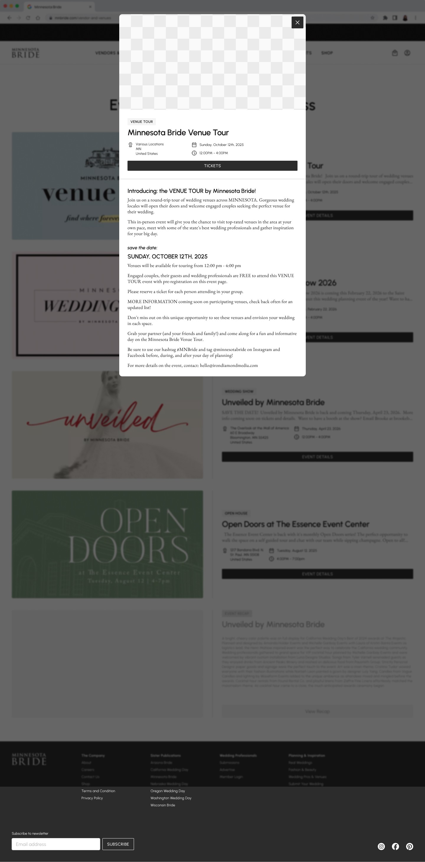
Wireframes


06
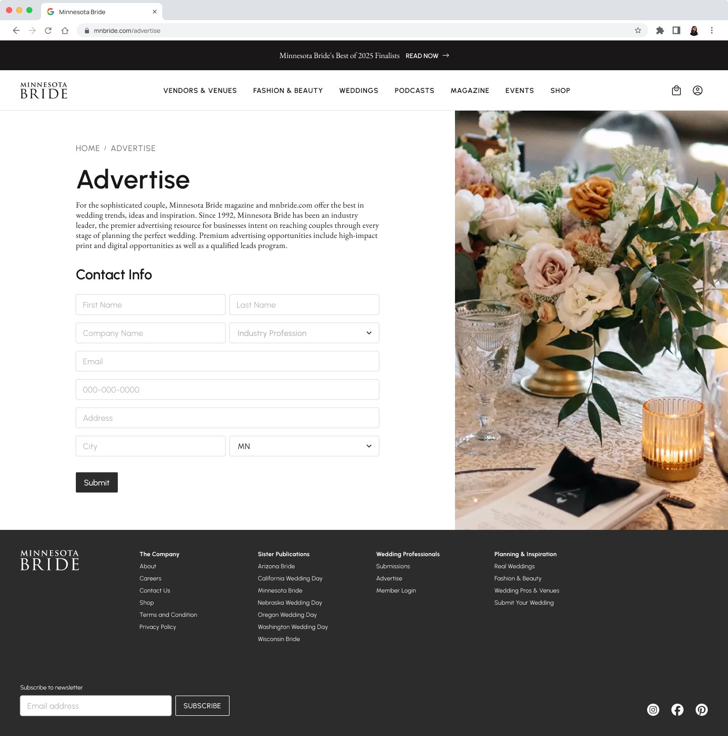
Final Screens
07
Impact
The redesigned system creates a scalable framework for both content and revenue growth.
While the project is currently in development, the new structure enables:
Increased ad placement opportunities
Improved content discoverability
Stronger brand positioning in a competitive bridal market