

Golden Design System
A strategic redesign of an enterprise design system (NDA-compliant reconstruction)

I began by auditing the existing system to gain an end-to-end understanding.
It became quickly apparent that the system lacked the governance and architectural rigor required to support a scaling product, resulting in fragmentation.
Inconsistent tokens and redundant components led to a fractured user experience.


// Guiding Principles
Reduce friction across design and engineering.
Govern and measure the system like any other product.
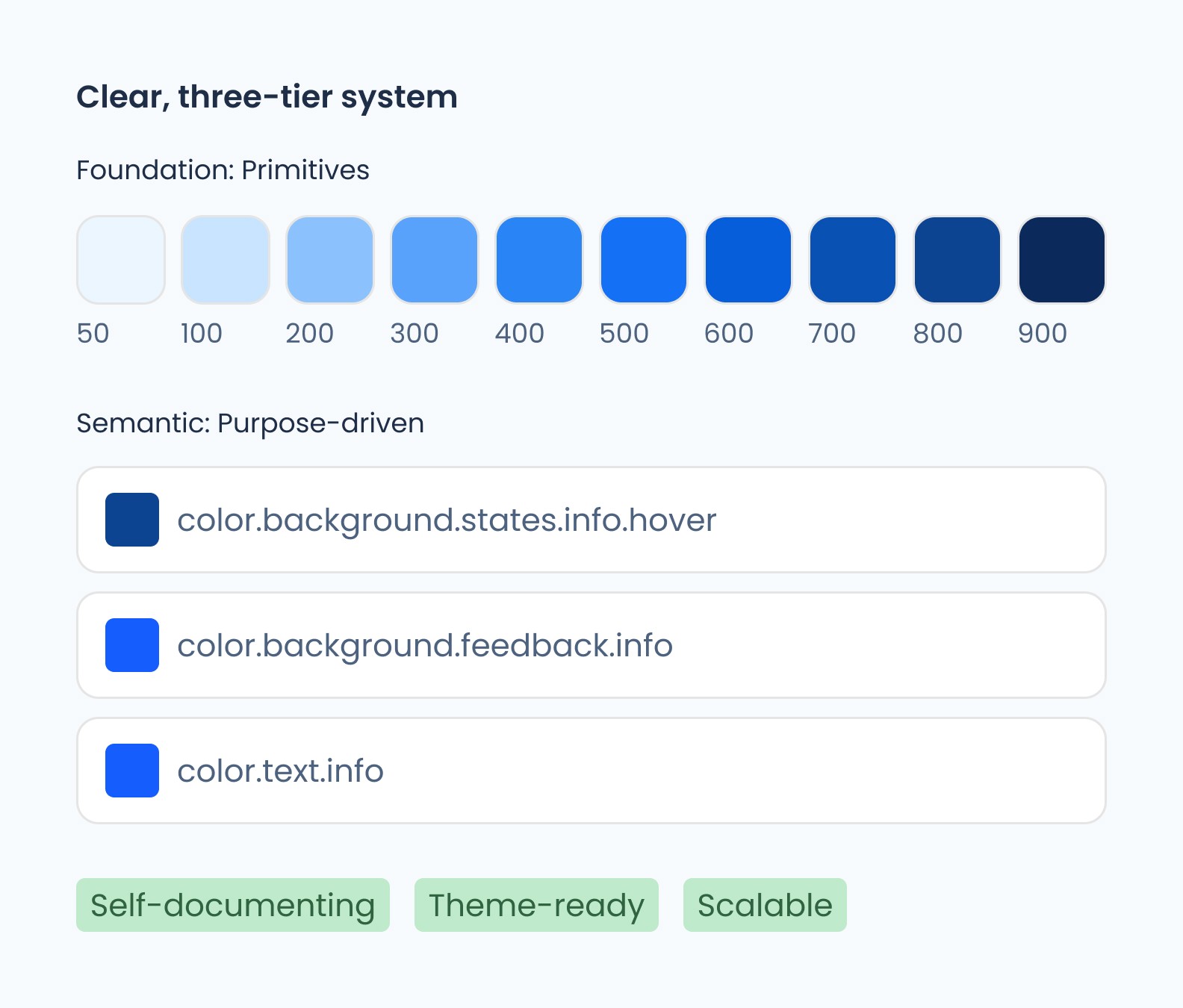
// Color System
Introducing a semantic color architecture was a crucial step in grounding the system. Primitive tokens defined the palette while semantic tokens translated those values into purposeful roles like background, surface, text, and status.
Decoupling value from meaning allows the system to scale cleanly and enable clearer design decisions, predictable engineering implementation, and future brand evolution.

Before

After
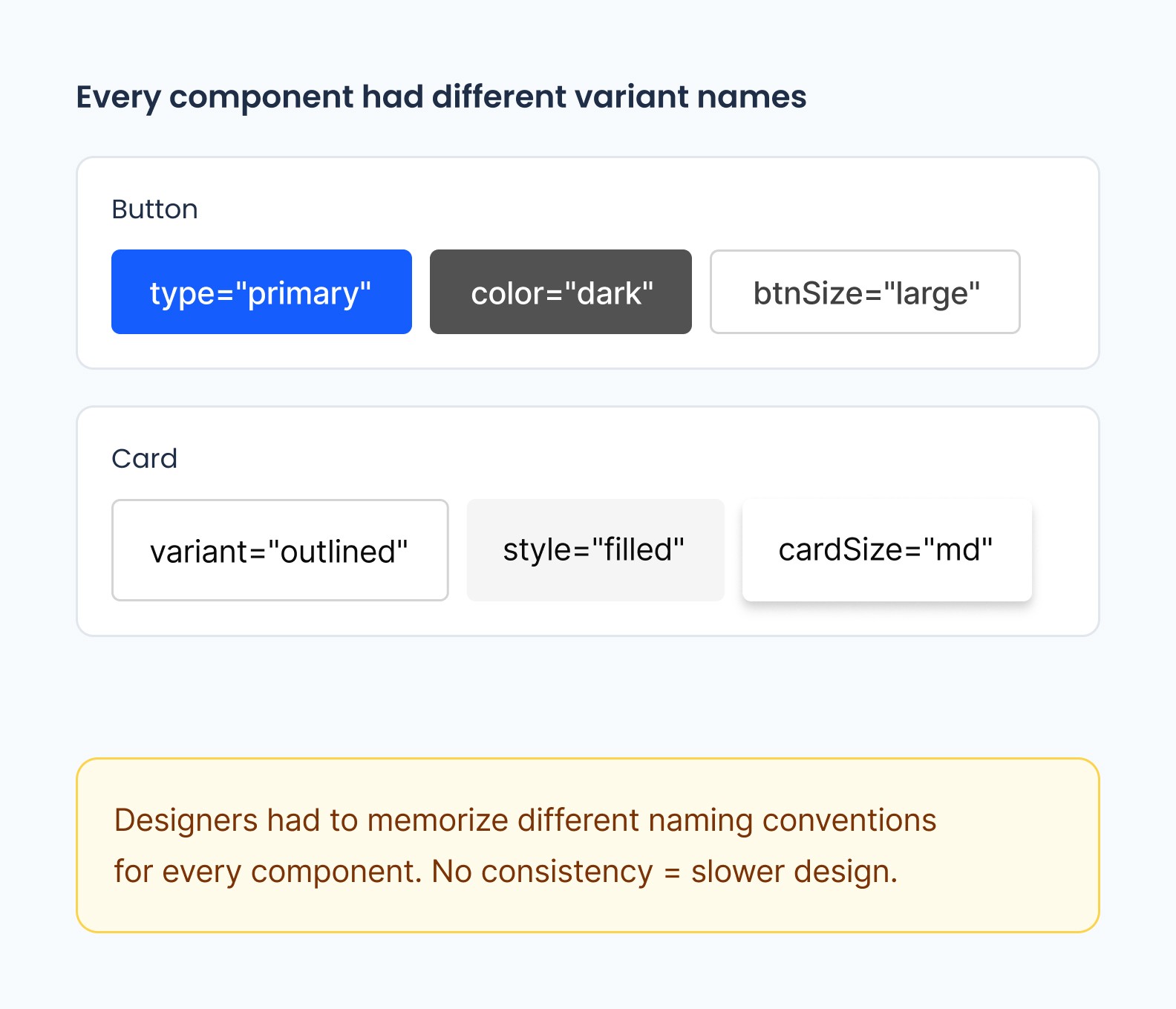
// Component Standardization
The legacy system attempted to achieve "infinite flexibility" through a massive list of unorganized boolean attributes. This forced designers to navigate a an abundance of toggles just to achieve a standard state.
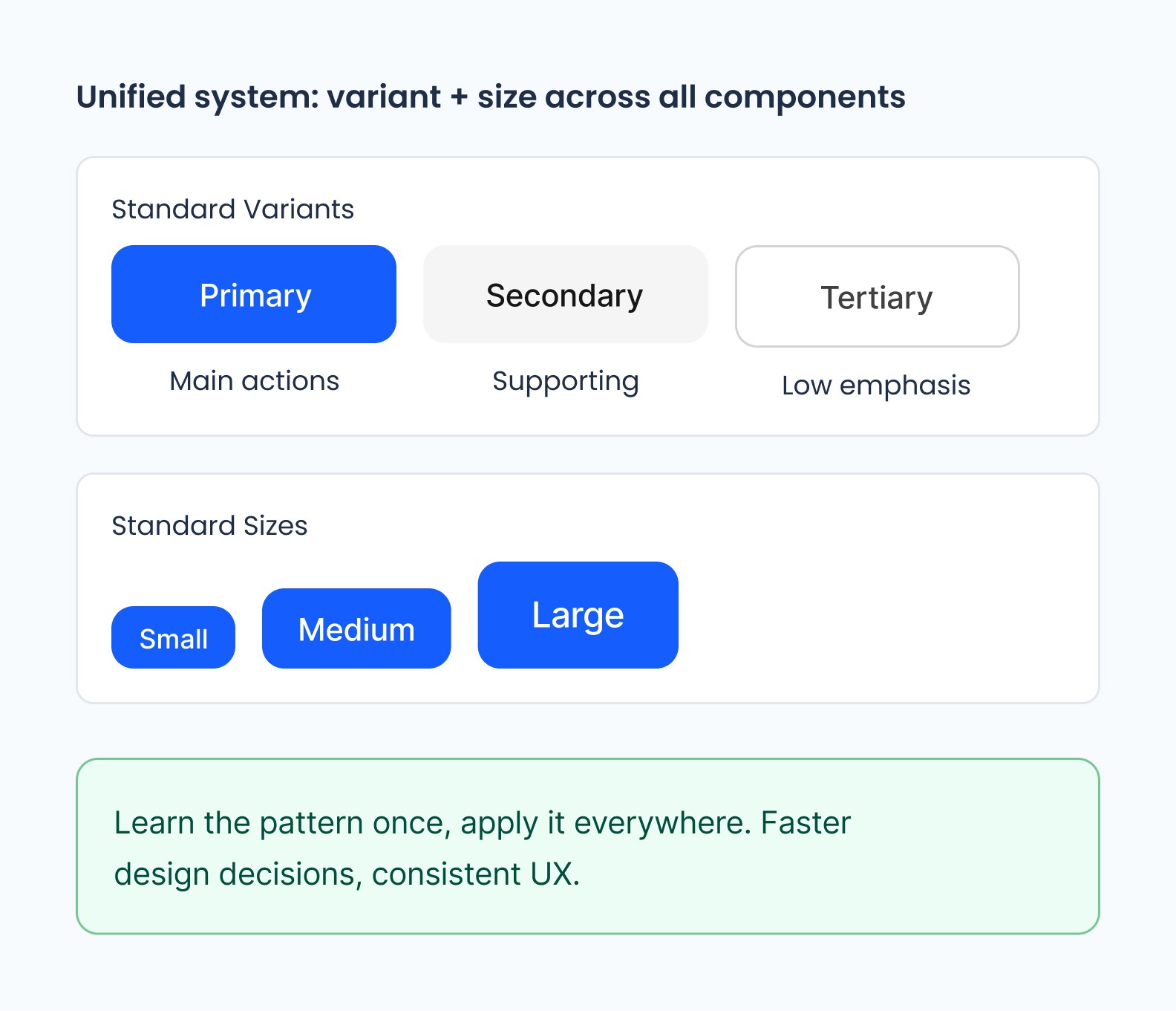
The Card had become a "Swiss Army Knife" of conflicting booleans. To fix this, I moved away from rigid configurations and toward a slot-based component architecture. maintaining consistency was supported by Figma Preferred Values .

// Shared Language
By establishing a predictable property schema across all design system elements, we increased our design to development velocity and ensured that the system could scale.
Before
After
// The Result
Allowing for teams to work with a standardized foundation of design variables, naming conventions, and styling built on intent rather than arbitrary scales, allowed for designers to pour all their creativity where is mattered most...
The success of the new design system proved to show designers felt more confident in their design proposals because their tool belt was better equipped for the overall branding and design direction.
// Takeaways
- Constraints are essential for scalable systems - A design system without philosophy will eventually collapse under its own flexibility - Cross-functional buy-in is as important as technical execution - Design systems should be treated as evolving products, not static libraries
// Measured Success
95%
60%
Faster handoffs
50+
3
Modes